How to publish a podcast on Apple Podcasts and Spotify
The best way to record, edit and publish a podcast in 2022.
Read more
How to create a password-protected podcast
In recent years, private podcasting has become increasingly popular. Individual podcast creators are using private podcasts as a way to monetize their show
Read more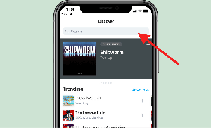
How to add podcast RSS to Pocket Casts manually
You can paste an RSS feed URL into the 'Discover' field in Pocket Casts. This will force the app to manually add the podcast to your list.
Read moreBest podcast software online
Top recommendations for podcast recording, editing, and hosting software
Read moreBest podcast affiliate programs
Earn affiliate revenue by recommending podcast hosting companies
Read more
×